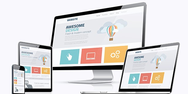
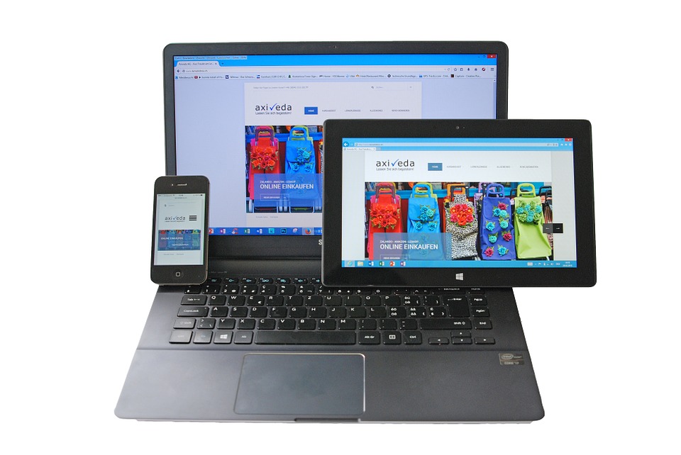
Have you ever noticed how some websites just seem to magically change design on a mobile device? You could look at a site on both your PC and your smartphone, and they appear a little different to each other! Such websites have what’s known as a “responsive” web design.
In a nutshell, a responsive website is one that adapts to a particular screen size or device type. If a site doesn’t have a responsive design, it will still usually display on a mobile device. However, the only difference is that it won’t look great. In fact, I’ve seen examples where the style and layout look pretty awful!
You are no doubt reading this because you might be wondering if you should have a responsive design. The short answer is yes. Stick around, and I’ll explain the long answer to you.
Most of your site visitors will be using a mobile device
If you don’t have any tracking systems in place like Google Analytics, go and install some on your site. Then, in a few days’ time, take a look at your stats. It might surprise you that most of your site visitors will be using a mobile device!
There is no denying that the use of smartphones and tablet devices is on the rise. They offer quick and convenient ways for all of us to go online and buy goods and services; we are no longer chained to our computers at home or in the office.
If you looked at a site on your smartphone, what would you do if the website’s design sucked? Or if perhaps half the content got clipped off the screen? And what would you do if you had to always zoom in on content?
The answer is simple: you would just go and check out some other websites! That’s a scenario you need to avoid with your website. A responsive website is far more likely to keep people viewing your site content.
You can’t use a non-responsive site for a new mobile app
Let’s say you want to build an iOS or Android app for your company. Part of the app’s functionality is to include an area where people can view some content on your website.

App users will feel frustrated if they can’t access the info they need through your app. Plus, your app developers can’t include certain functionality to enhance the user experience. In short, mobile apps are pointless if your website’s design is not responsive!
Less maintenance
Spare a thought for the person or team that has to manage your website for you. The last thing they want to do is duplicate their efforts on different variants of your site!
One of the advantages of responsive web design is that it’s quicker to apply updates. Any changes get made from one base, as it were. And those changes will then apply to both desktop and mobile versions of your site at the same time.
Conclusion
As you can appreciate, it makes perfect sense to have a mobile-friendly, responsive website. After all: the benefits outweigh the cons!
Websites by Masterhouse
Masterhouse Media is an innovative digital consulting agency from Vancouver, BC specializing in web design, social media and digital strategy. Masterhouse is best known for launching the popular Internet portal Clubvibes.com in 1999, one of the first social media platforms on the Internet. The company is currently focused on building digital strategies and premium websites for clients. Find out more at masterhouse.net


